Reworking Familiar Interfaces
Exploring how wireframe structures shape digital experience.
Category
UI/UX Case Study
Scope
Visual Structure
Usability Redesign
Lo-fi Wireframing
Industries
Cross-industry,
Web Interfaces
Date
October 2024
Understanding the Prompt
This challenge explored how layout alone shapes user experience. Using only low-fidelity wireframes, I examined how structure influences usability without relying on visuals, copy, or color. The goal was to map user flow and hierarchy through grayscale sketches.

How I Got Started
Before jumping into rearranging anything, I started with Apple Notes on my iPad since it automatically detects shapes while sketching. I recreated the two layout by hand to examine its structure more closely. I suspected spacing might be contributing to user friction, so I used the ruler tool to measure both outer and inner component spacing, aiming to spot visual inconsistencies.
Next, I rebuilt the layouts in Figma using simple boxes to figure out how much how much space each element took up. Since we couldn’t add or remove components, it gave me the freedom to experiment with positioning while sticking to the assignment’s constraints. This approach helped me generate 3 to 5 layout ideas with more intention and clarity.
Wireframing the Interfaces
Confluence
Confluence is a collaboration platform used by teams to create, organize, and share content—widely adopted in software, project management, and marketing workflows.
This video highlights the interface flow and structural strengths that make Confluence feel intuitive.
Why Confluence’s layout works well
01
Clear structure and alignment
The layout is well-ordered with consistent spacing and straightforward navigation, making it easy to scan and use.
02
Content-focused and minimal
Users can expand the main document view to remove clutter and stay focused on the task at hand.
03
Familiar yet efficient
It resembles a simplified word processor with collaborative superpowers, making it intuitive for both new and returning users.
04
Adjustable sidebar navigation
The ability to expand or collapse the sidebar adds to user flexibility and focus.
05
Effortless sharing and versioning
Uploading, commenting, and tracking updates is streamlined—critical for fast-paced, collaborative teams.

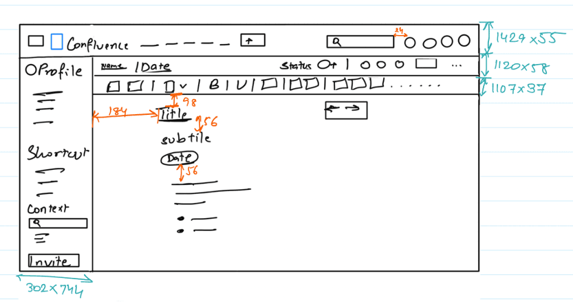

Low-fidelity sketch (left), measured version for spacing (middle), and layout recreation in Figma (right)
Canvas
Canvas is a Learning Management System (LMS) used across schools and universities to streamline educational content management. It supports educators, students, and administrators in managing coursework, communication, and deadlines.
This walkthrough shows how the layout may challenge students’ focus and task efficiency.
What I noticed in Canvas’s layout
01
Uneven spacing
Inconsistent spacing between elements made the layout feel visually cluttered and harder to scan.
02
Excessive scrolling
Important information was scattered, forcing users to scroll more than necessary to find what they need.
03
Poor placement of key tasks
Elements like the calendar and to-do list were not immediately visible, slowing down quick task access.
04
Inefficient use of space
On wider screens, the design left too much blank space on the right, making the layout feel unbalanced.

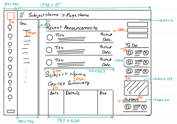

Low-fidelity sketch (left), measured version for spacing (middle), and layout recreation in Figma (right)
Reflecting on the Iterations


What Low-Fidelity Taught Me
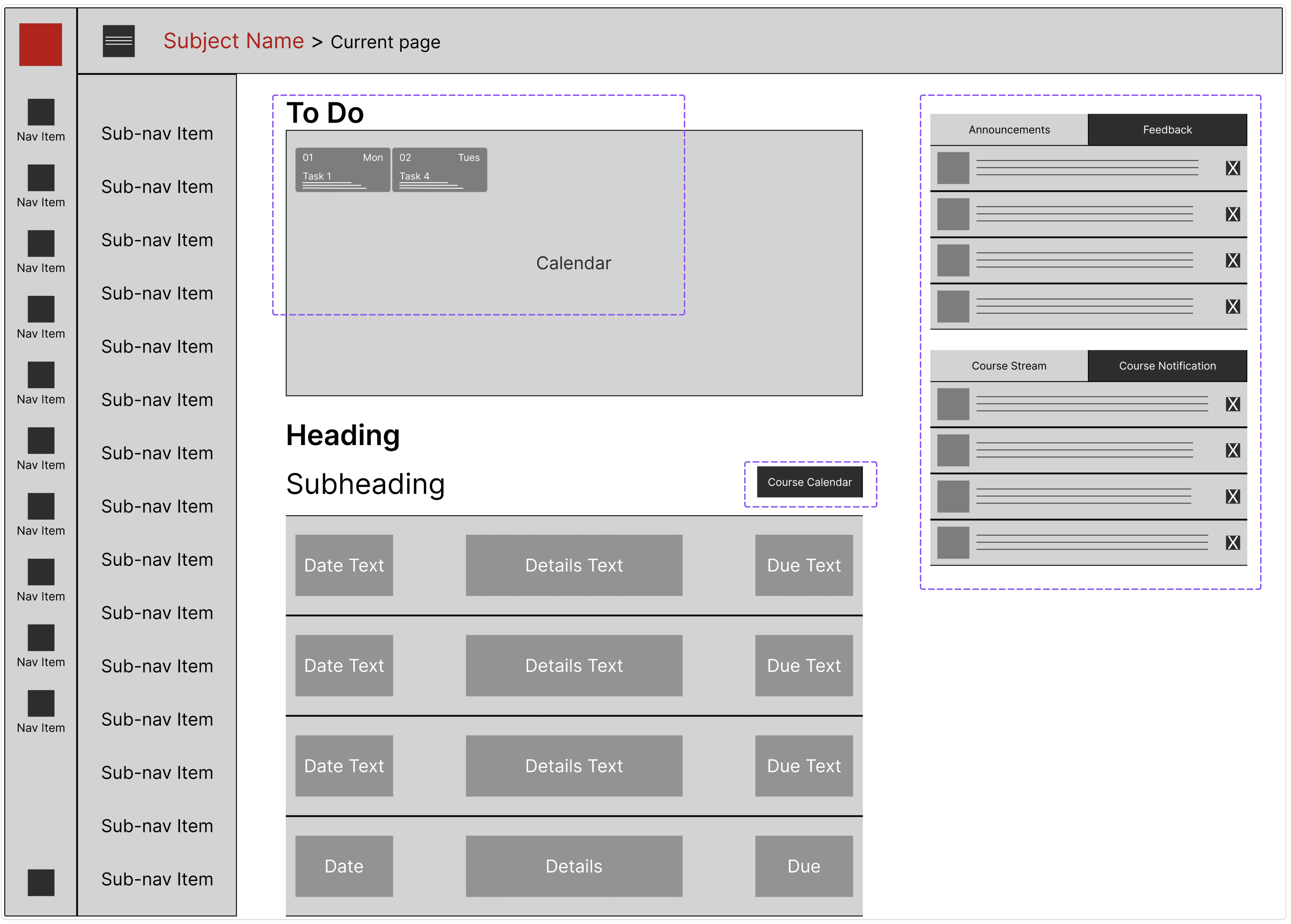
Out of the four versions I explored, iteration 3 and iteration 4 felt the most aligned with a student’s daily needs. Iteration 3 brought the calendar forward and placed to-do tasks inside it. That structure felt more cohesive and intentional, like how Google Calendar or iCal combine deadlines and events to help manage time and tasks in one view.
Iteration 4 built on that thinking. I added a tabbed layout to organize the right-side content into sections for announcements and feedback. This reduced clutter while keeping updates easy to find. Throughout both versions, I kept asking one thing—what would help a student stay on track? To-do items needed to be visible and accessible, even if that meant rethinking familiar UI patterns.
Back to top