Billing Portal Redesign
At a Glance
Problem
Users faced slow performance and scattered layouts. Overuse of tables and intrusive popups made billing tasks harder to complete.
Approach
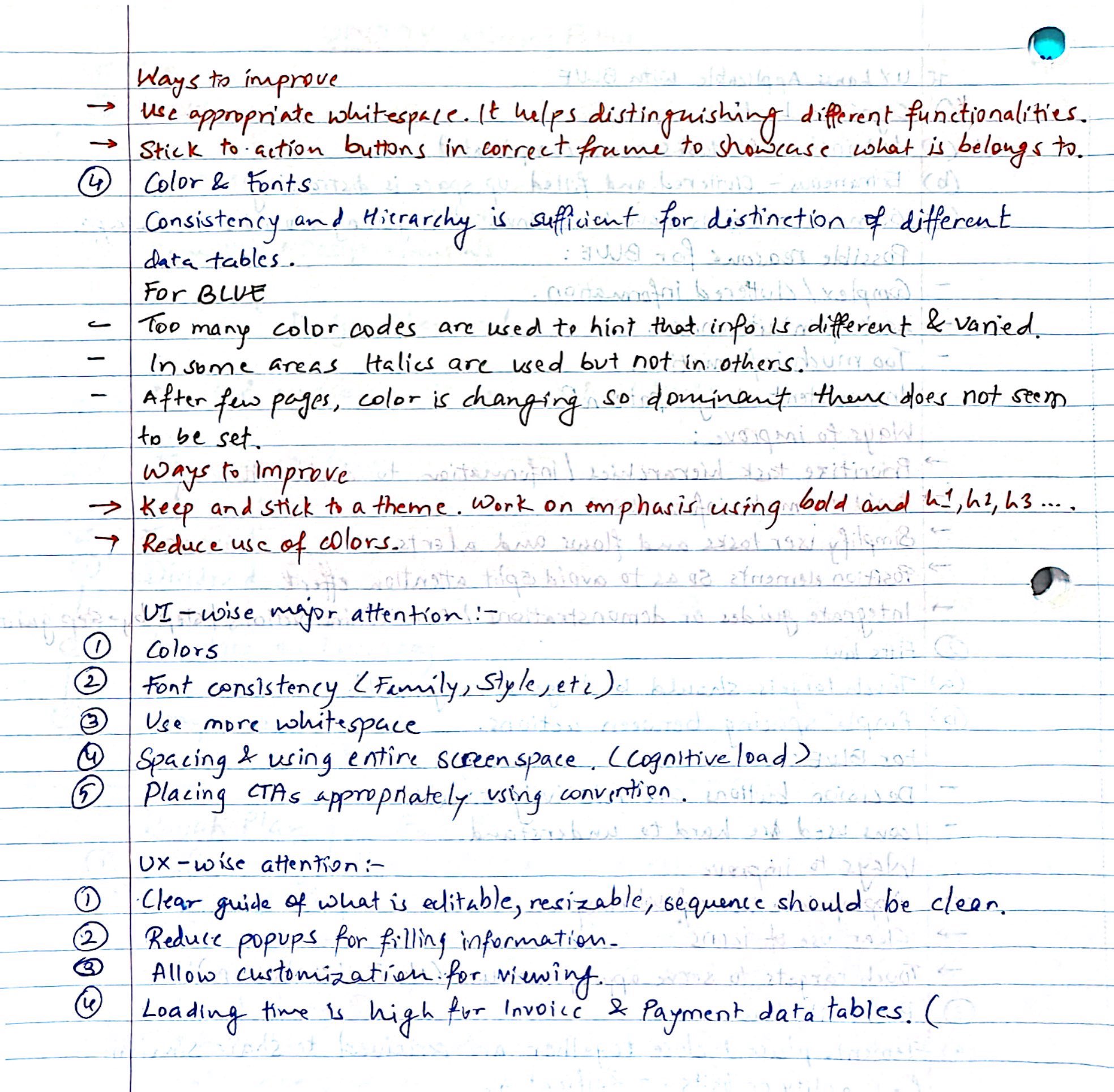
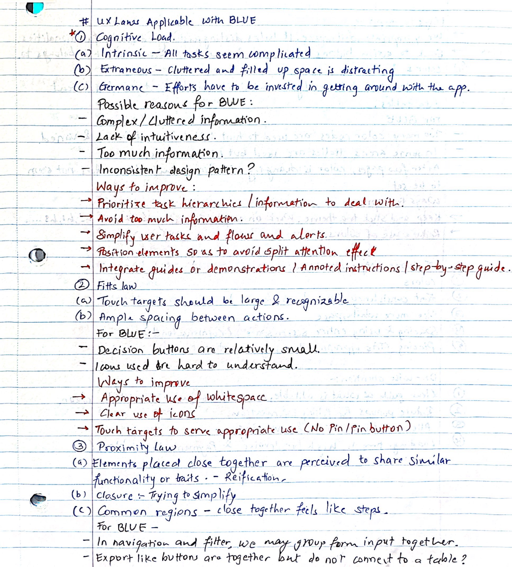
Audited two high-traffic pages. Logged usability issues and pitched layout alternatives. Followed up with a survey to gather feedback from internal users across experience levels.
Collaboration
Partnered with PMs and design leads to restructure information, minimize disruptions from popups, and modernize layouts in line with the design system.
Outcome
Improved workflows for 1,000+ users. Delivered a cleaner layout, clearer edit flows, and faster access to billing data.

Due to confidentiality, original designs cannot be shared. The visuals here illustrate the design direction and problem-solving approach.
Overview
The Utility Billing Portal is nearly a 15-year-old legacy tool for billing, account tracking, and customer care workflows. I focused on modernizing two high-traffic pages—Utility Account and Billing Account—to reduce cognitive load, unify the interface, and improve task efficiency for over 1,000 users.

Role
UX Design Intern in Retail Market Services
Duration
10 Weeks
Tools

Figma

Miro

Confluence

Forms
My Approach

What I Uncovered
I
Contextual Inquiry
Ran the first internal survey with 25 users to surface layout and navigation pain points.
II
UX Audit & Analysis
Mapped scroll fatigue, UI friction, and layout blockers into actionable fixes.
III
Industry Research
Explored inline edits, filter panels, and layout alternatives to reduce table-heavy UI.
The Challenges
Redesigning the Utility Account Page revealed key UX issues that disrupted everyday workflows for all user roles. The solutions aimed to directly addressed each of these points.

Solution
The redesign was informed by feedback from internal business analysts, long-term clients, and customer care agents who relied heavily on this tool for daily workflows.

Final redesigned Utility Account Page with key features highlighted
Layout & Workflow Simplification
01
Grouped Layout for Clearer Structure
02
Table-to-Column Layout Shift
03
Edit Pattern Overhaul
04
Streamlined Account Search
Enhanced Usability Features
05
Smarter Export Options
06
Context Cues & Navigation Reinforcement
Wireframes & Sketches


What I learned
Recognized the value in legacy UI decisions; sometimes it's evolution, not overhaul.
Breaking work into clear sections helped drive clarity in both strategy and execution.
Designing surveys taught me how to ask targeted UI/UX questions for richer insights.
Reusing right-side drawers promoted visual familiarity and strengthened product cohesion.
What I would do differently...
01
Target each user group (analysts, support agents, clients) more intentionally for deeper, role-based insights.
02
Avoid broad portal questions; ask page-specific ones and use tools like heatmaps to uncover confusion and delays.
03
Let users dynamically show or hide advanced filters based on task needs or input type.
Back to top