


Understanding the Prompt
As part of a design course, I was tasked with designing three distinct home page mockups for a fictional online bank — UX Bank.
Each version needed to spark a distinct emotional response using only visual design elements—color, layout, typography, and language.
The goal was to explore how design influences trust, clarity, or engagement.

Research and Strategy
Designing for Diverse Needs Starts with Empathy
To tailor each UX Bank homepage to distinct personas, I combined observational insights with HCI-backed research. I identified three core groups—elders, color-blind users, and digital nomads—and translated their needs into actionable design strategies.
Personas


Aligning Design with Emotion
Each homepage was designed to reflect the emotional needs and cognitive habits of specific user personas.
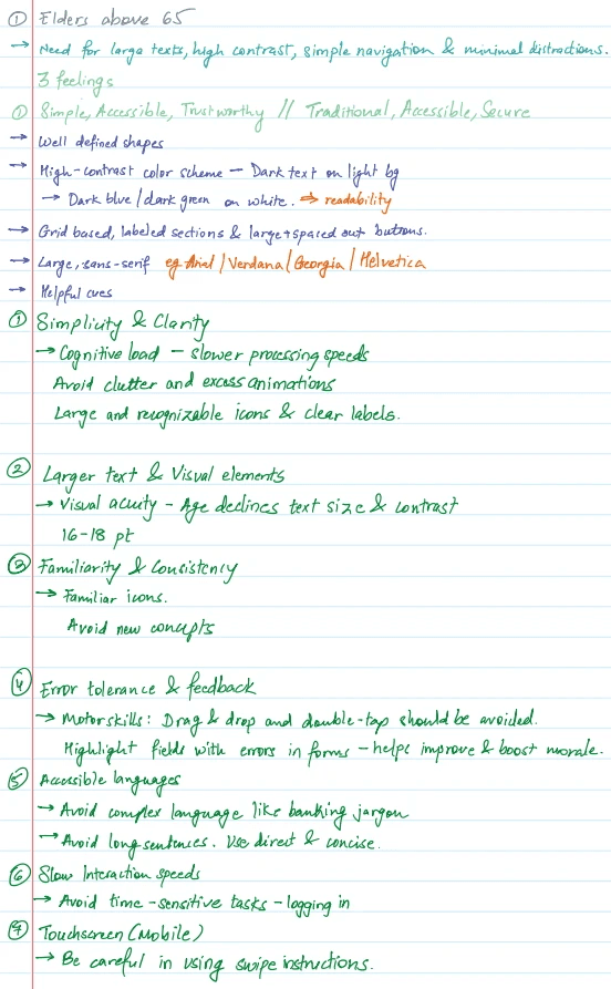
Elders Above 65
Theme: Trustworthy · Accessible · Simple
I
Design Goals
Minimize cognitive load with a clean, familiar layout
Use large, high-contrast text for better readability
Avoid gestures that require fine motor skills (e.g., swipes or double-taps)
II
Visual Style
Grid-based structure with labeled CTAs
Dark blue and dark green on white for contrast
Sans-serif fonts like Helvetica for clarity
Color-Blind Users
Theme: Functional · Inclusive · Clear
I
Design Goals
Reduce ambiguity by avoiding red-green pairings
Ensure key actions and statuses are visible through shape, text, or iconography—not color alone
Keep the interface visually distinct and scannable
II
Visual Style
Purple-yellow-gray palette for clarity
Non-color cues like underlines, icons, and bold text
Clear, consistent visual hierarchy and button styles
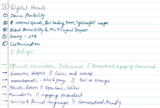
Digital Nomads
Theme: Personalized · Global · Efficient
I
Design Goals
Deliver fast, responsive UI optimized for mobile and low bandwidth
Support multiple languages and currencies
Guide users smoothly through repeated tasks with recognizable flows
II
Visual Style
Teal and orange palette to balance professionalism and energy
Rounded icons and flowing shapes for movement
Roboto and Open Sans for cross-device readability
Bringing It All Together


Looking Back
For elders, I wanted the layout to feel familiar and trustworthy. But on reflection, the design may still feel dense. I now see that more whitespace and reduced reading effort could improve comfort and clarity.
For color-blind users, I tried to avoid making the experience feel “specialized” or isolating. I used contrast and icons instead of just color cues. But maybe adding a clear toggle would help signal that this space truly understands and supports them.
For digital nomads, I focused on visuals and flow, but I missed opportunities like quick-access global language settings or a currency converter—things that would have reflected their on-the-move lifestyle better.


Back to top