Utility billing portal redesign
TL;DR
Problem
Users struggled with outdated workflows and inefficient navigation, increasing time spent on billing-related tasks.
Approach
Led a survey within the Retail Market Services department, engaging users and maintainers of the portal to identify key pain points.
Collaborated with cross-functional teams to modernize the portal and align it with updated design system standards.
Outcome
Delivered a user-friendly redesign, improving workflows for over 1,000 users and ensuring alignment with modern design standards.

Confidentiality restricts sharing original designs; visuals highlight implemented solutions and design approach.
Overview
The Utility Billing Portal, a 15-year-old legacy software, served as a crucial tool for billing and account management for businesses and internal users. As a UX Design Intern at Customized Energy Solutions, I was tasked with redesigning two key pages to enhance usability, address workflow inefficiencies, and align the portal with modern design standards.
Key contributions
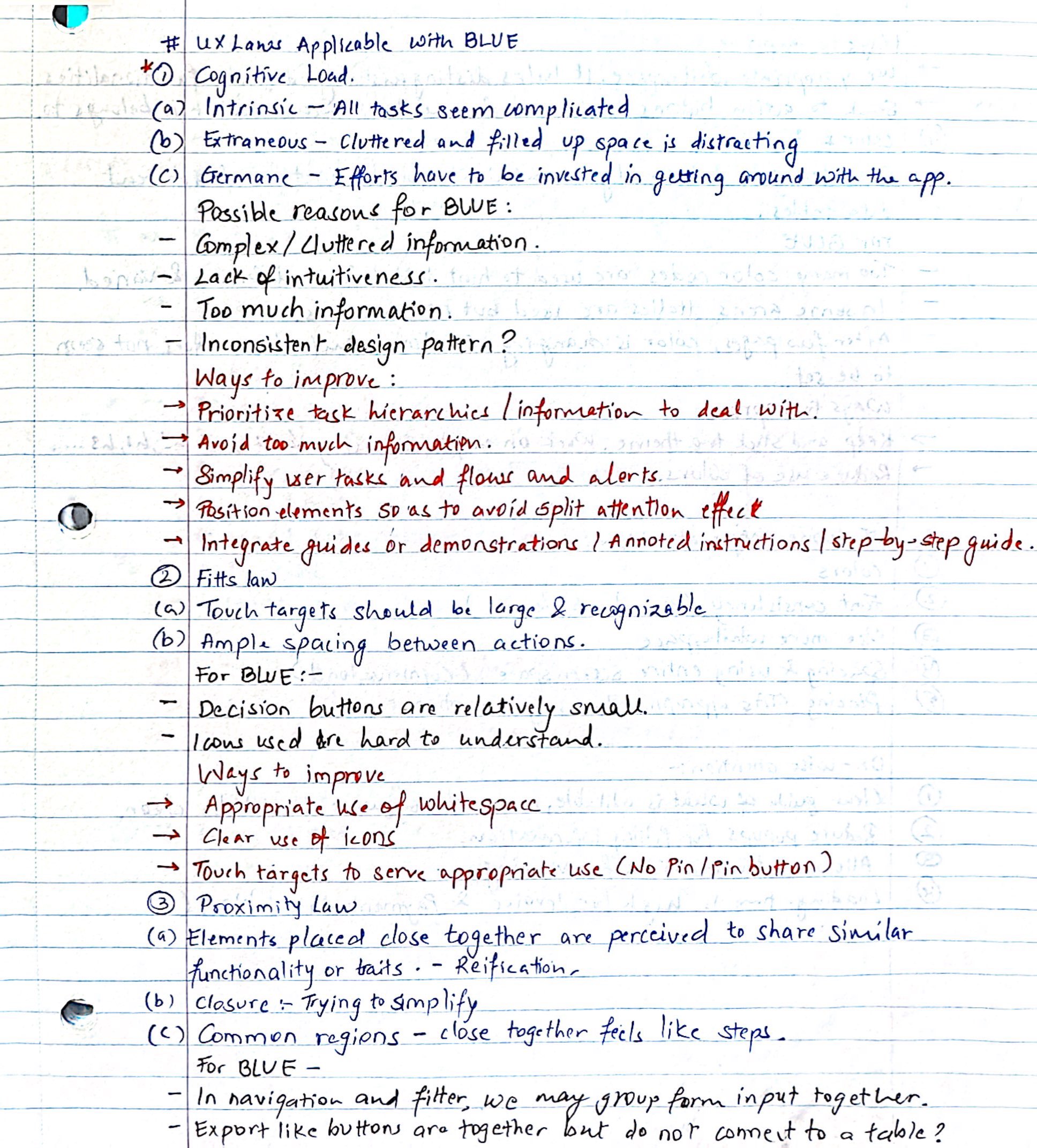
Conducted user research to uncover usability pain points and prioritized user needs through survey insights.
Streamlined workflows and delivered a scalable redesign aligned with modern design standards.
Enhanced the user experience for over 1,000 users across departments and businesses.
Role
IT UX Design Intern
in Retail Market Services
Duration
10 Weeks
Tools

Figma

Miro

Confluence

Forms
Problem Statement
Users struggled with inefficient workflows and cluttered data presentation, leading to reduced productivity and increased cognitive load across departments and businesses.
My Approach
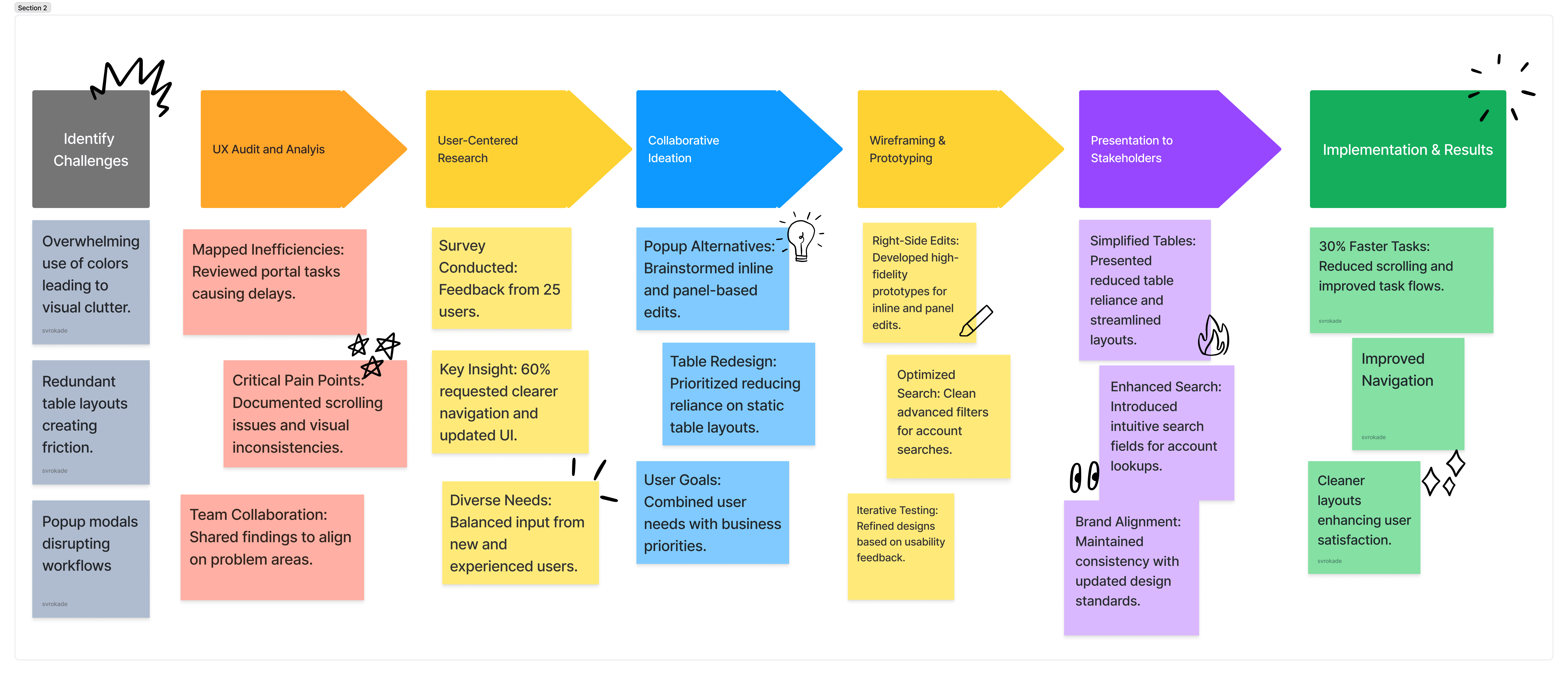
Research Insights
01
Contextual Inquiry
Identified navigation and layout issues via survey with 25 various users.
02
UX Audit & Analysis
Improved scrolling and usability with actionable fixes.
03
Industry Research
Proposed scalable solutions like inline editing and column filters.
The Challenges
The Utility Billing Portal, a 15-year-old legacy software, faced critical usability issues:
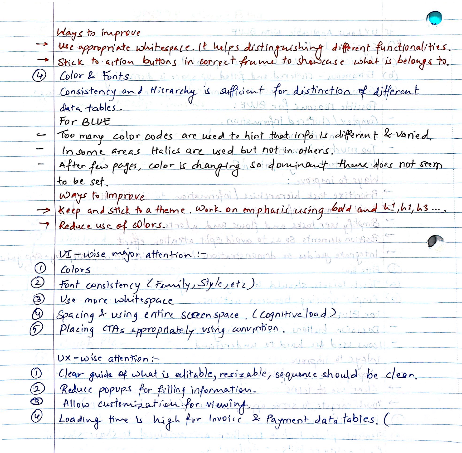
Cognitive overload caused by excessive reliance on colors to differentiate table data, leading to inconsistencies.
Redundant scrolling due to uneven table lengths and cluttered layouts, making navigation inefficient.
Interruptive workflows from popup modals for field edits, disrupting user experience.
Slower task completion times due to performance lags, frustrating both seasoned and new users.
Key Results obtained
Streamlined Navigation
Enhanced task flow to improve the user experience across all roles, from analysts to customer care agents.
Increased Efficiency
Task completion times improved by optimizing workflows and eliminating popups, benefiting over 1,000 use
Enhanced Usability
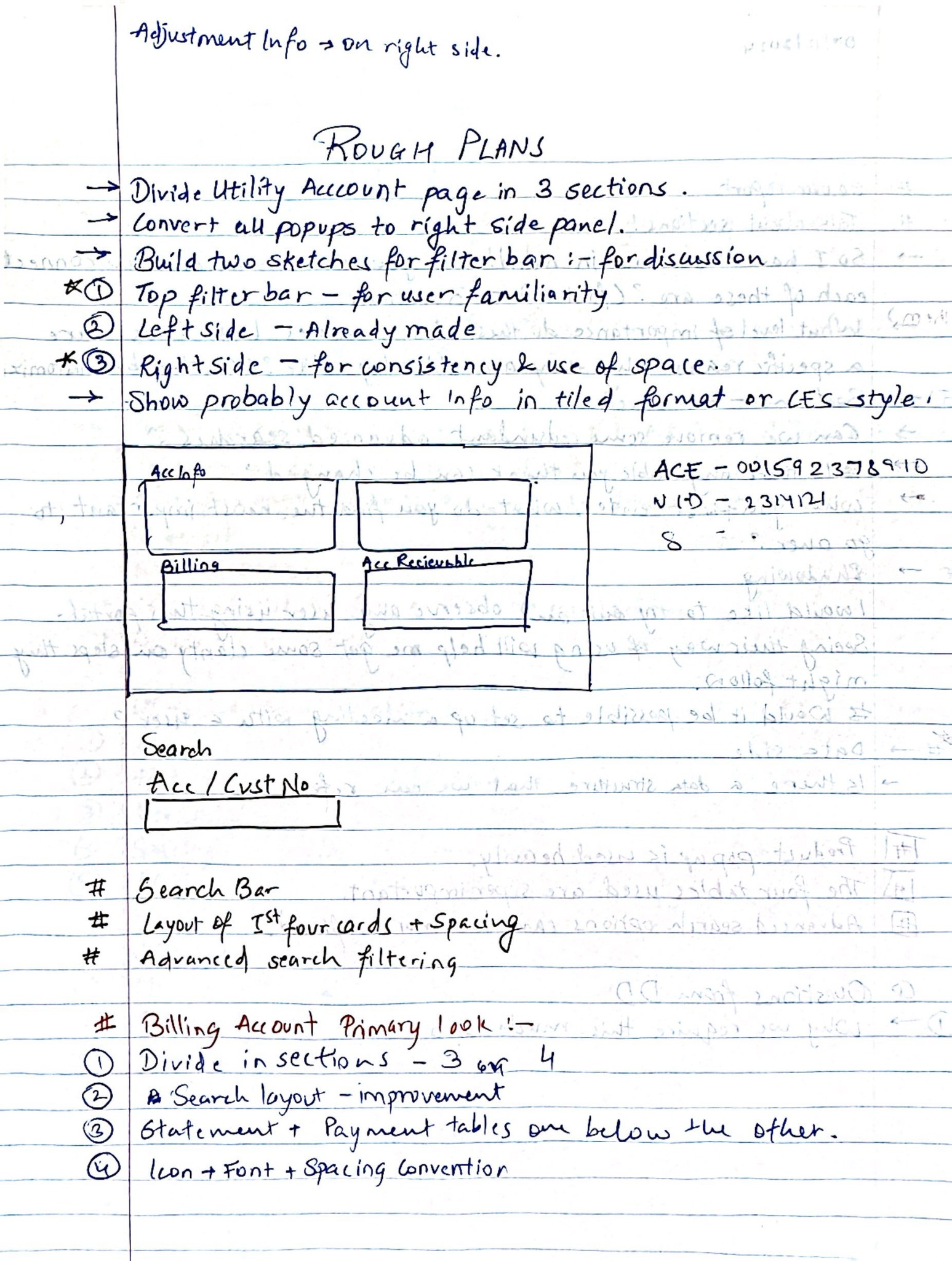
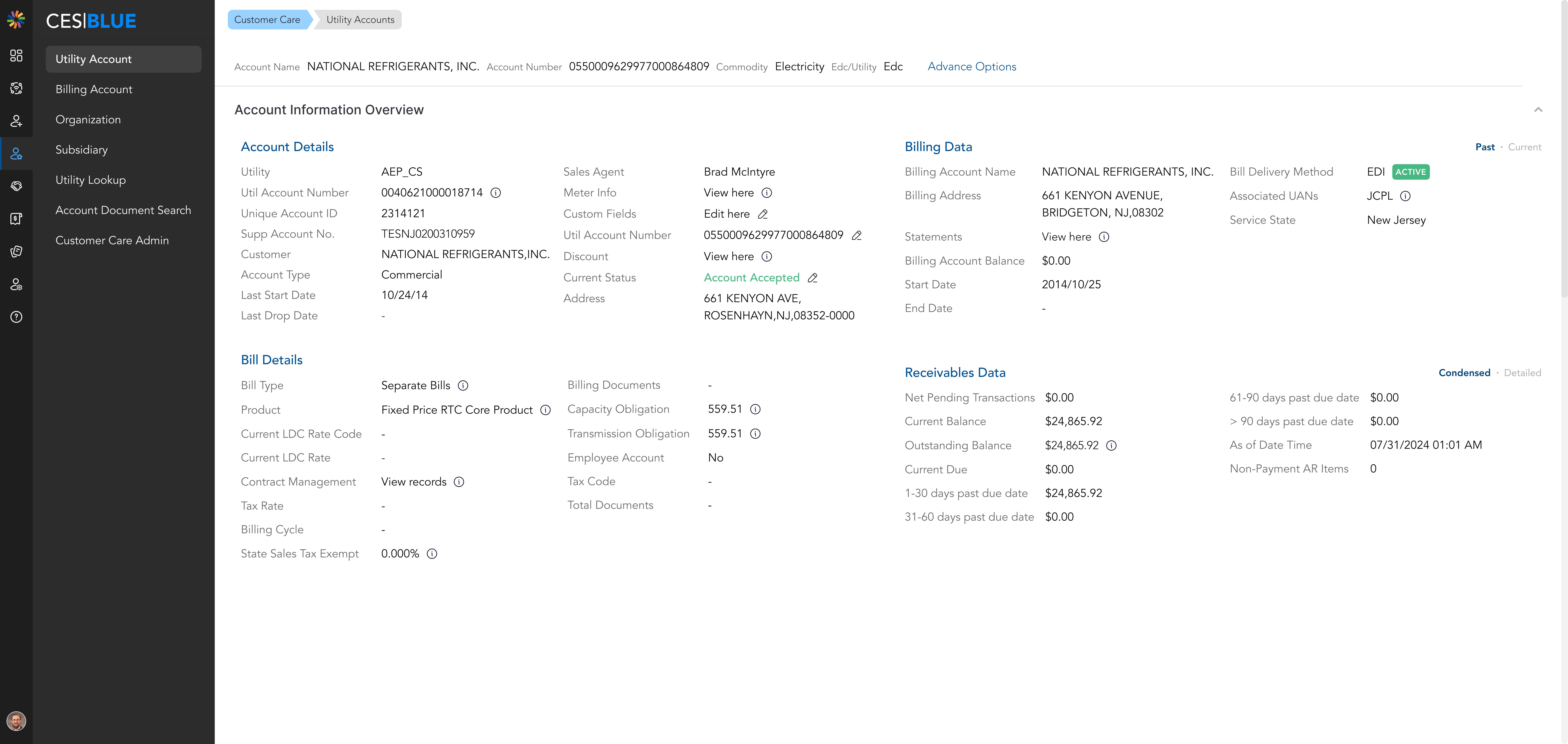
Static information previously cluttering the table is now located in a right-side drawer.
Addressed key pain points from survey feedback, delivering a scalable solution tailored to business and departmental needs.
Solution
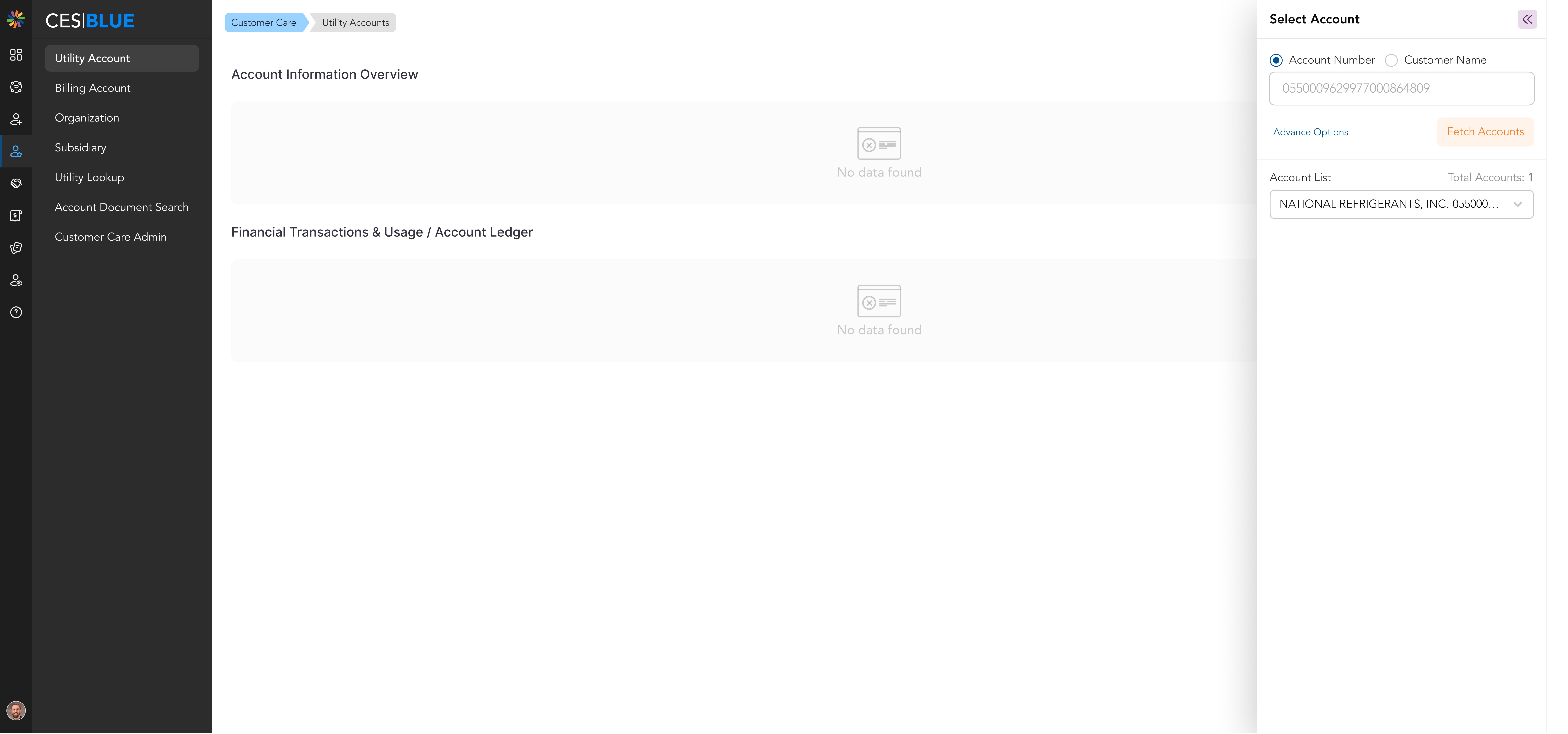
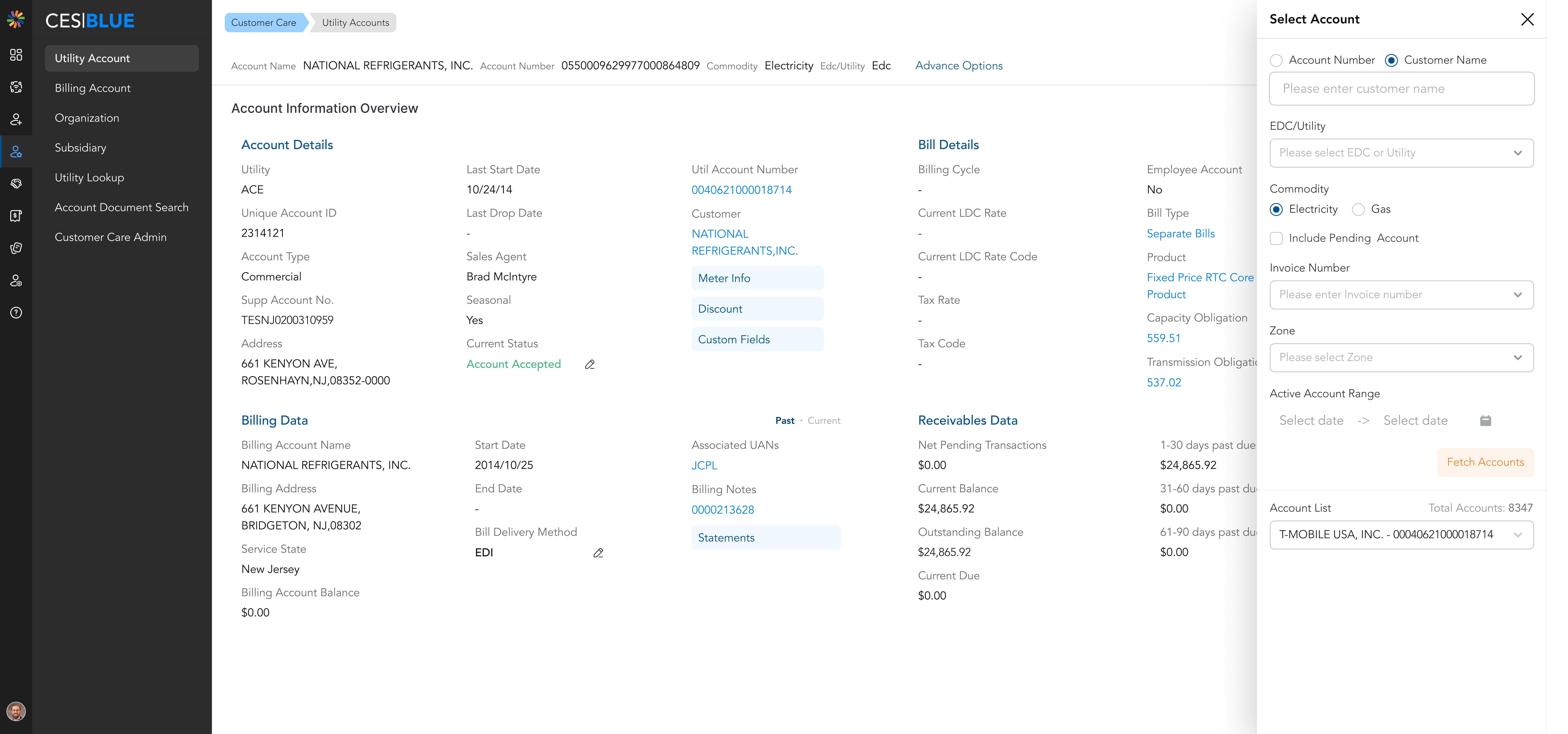
Optimized search functionality
Redesigned search options with an intuitive interface that allows users to seamlessly search accounts using names or numbers. Integrated advanced filters, enabling targeted and efficient retrieval of specific accounts or transactions.
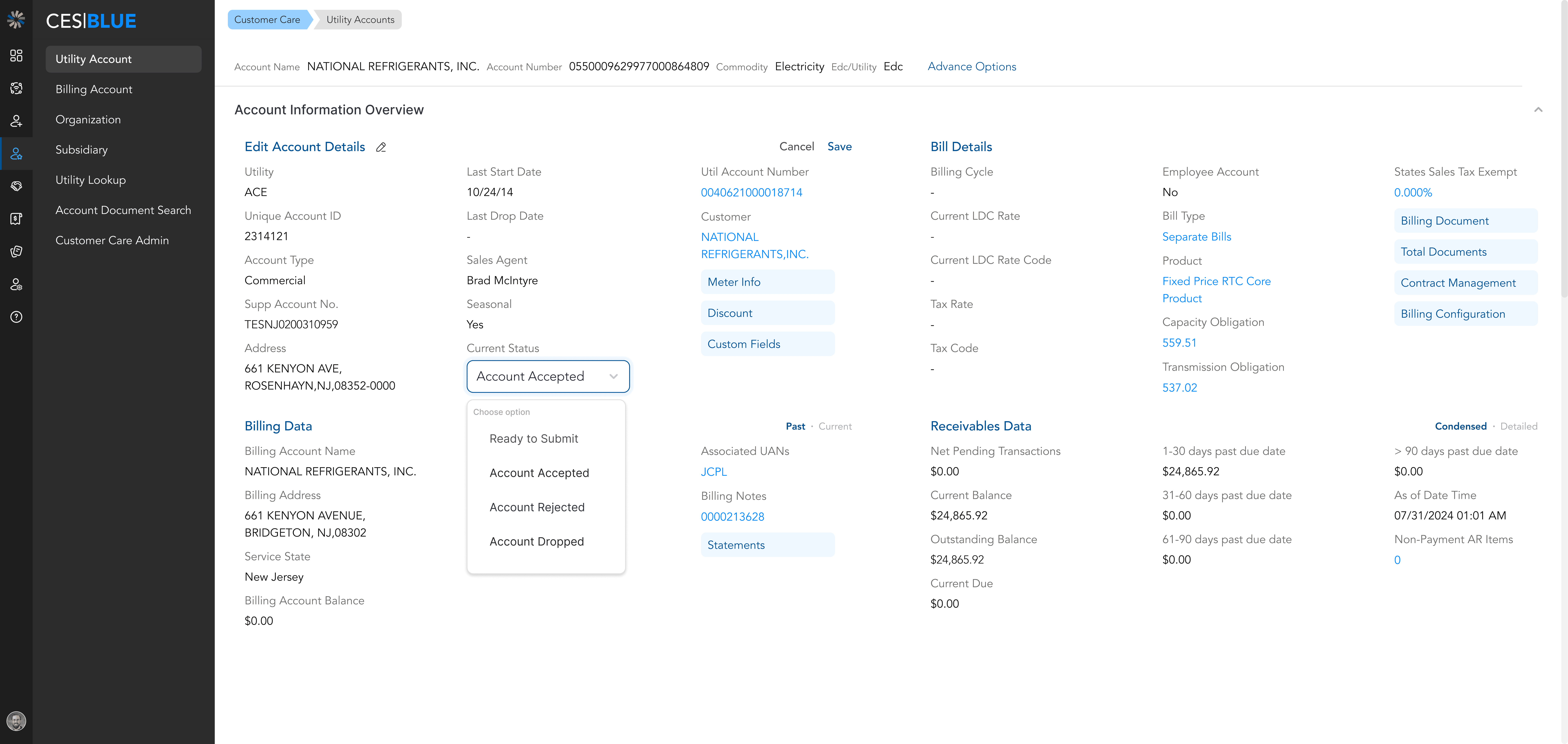
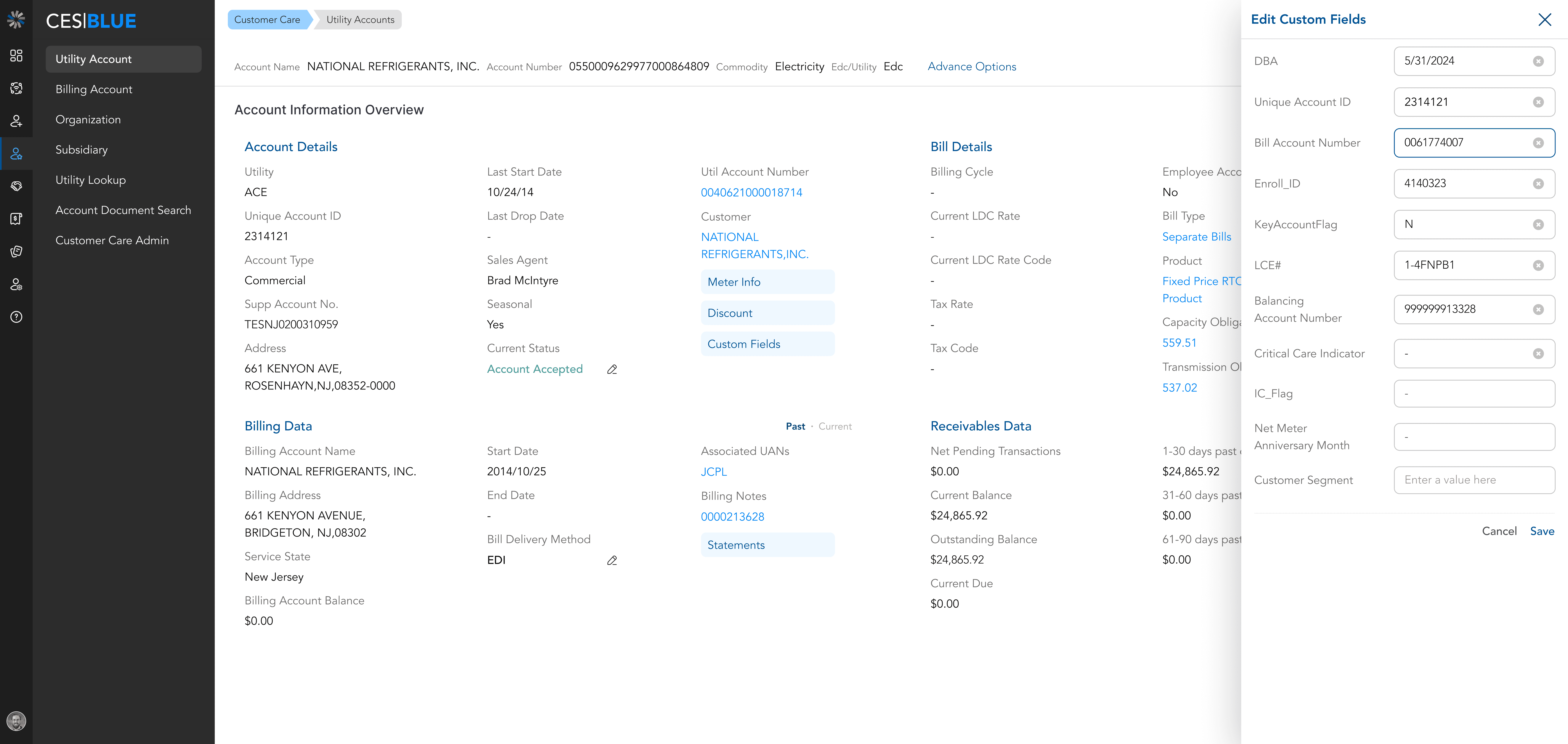
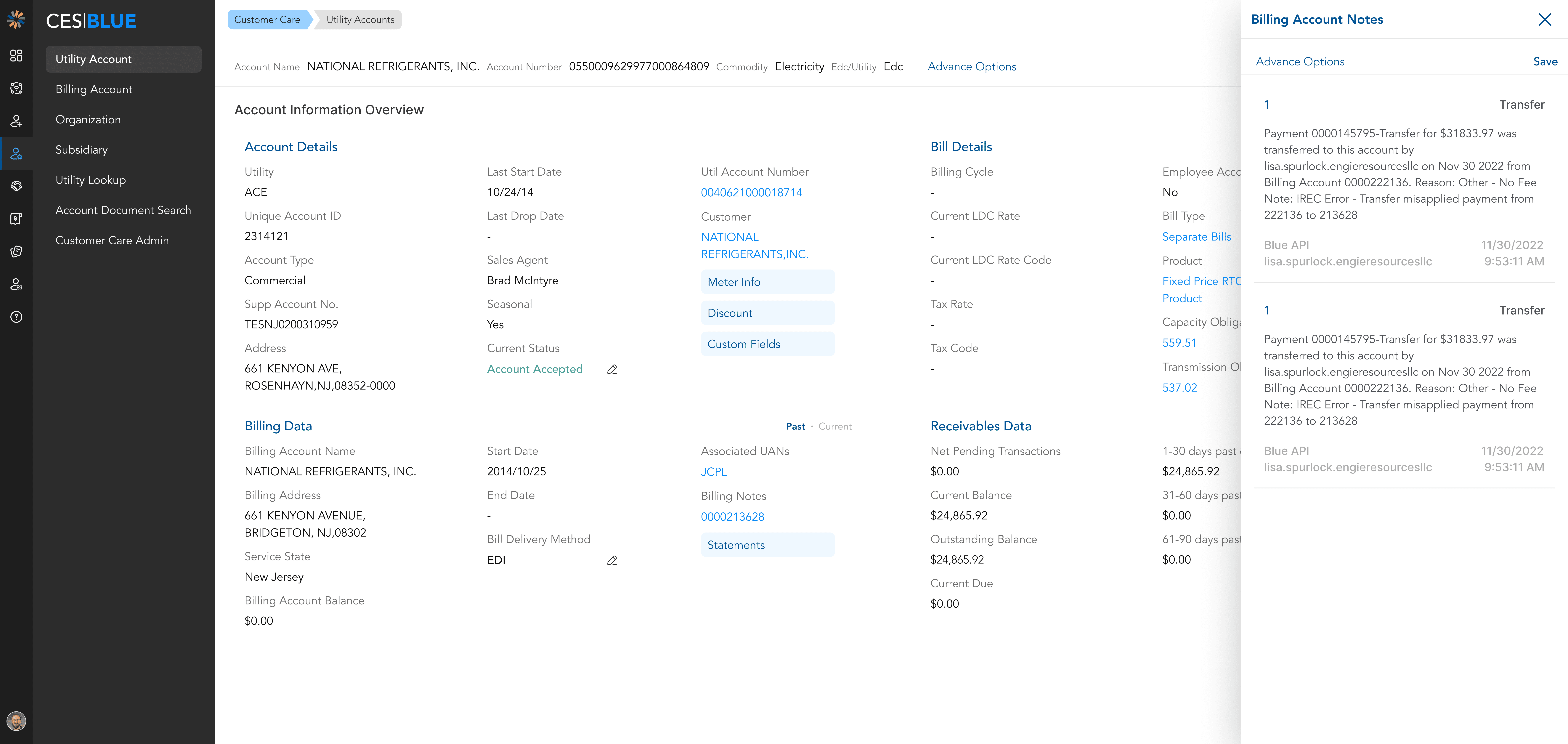
Popup-free interactions
Replaced modal popups with in-line editing and right-side panels, ensuring seamless workflows.
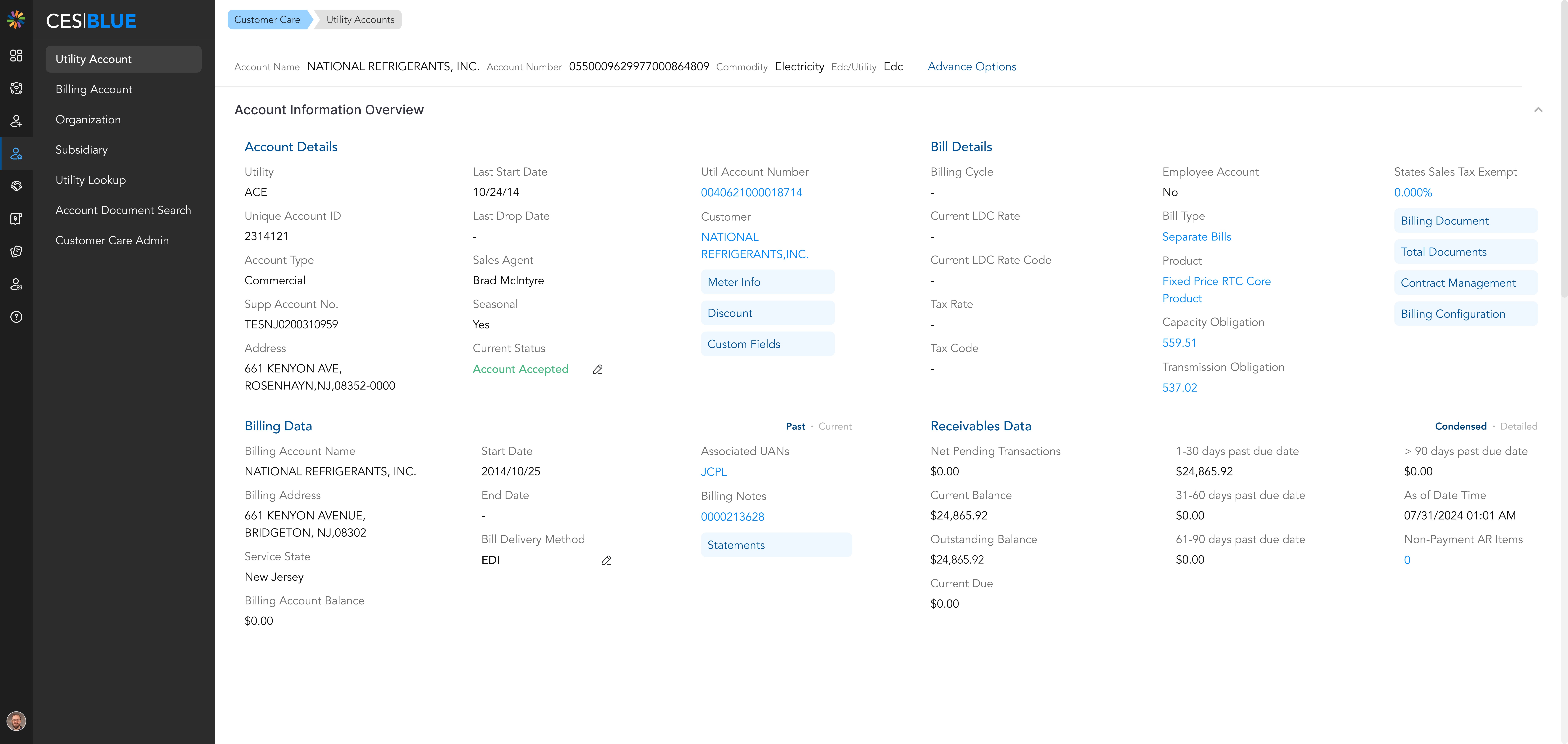
Minimized table reliance
Introduced a redesigned layout that reduced the dependence on traditional tables while seamlessly integrating static and editable fields.
Wireframes & Sketches
